01
Project Overview
02
The Problem
03
Discovery & Strategy
Research revealed that trust had become one of the category's most overused messages. Instead of making louder claims, the strategy positioned transparency as the brand's greatest strength.

04
Identity System
Logo
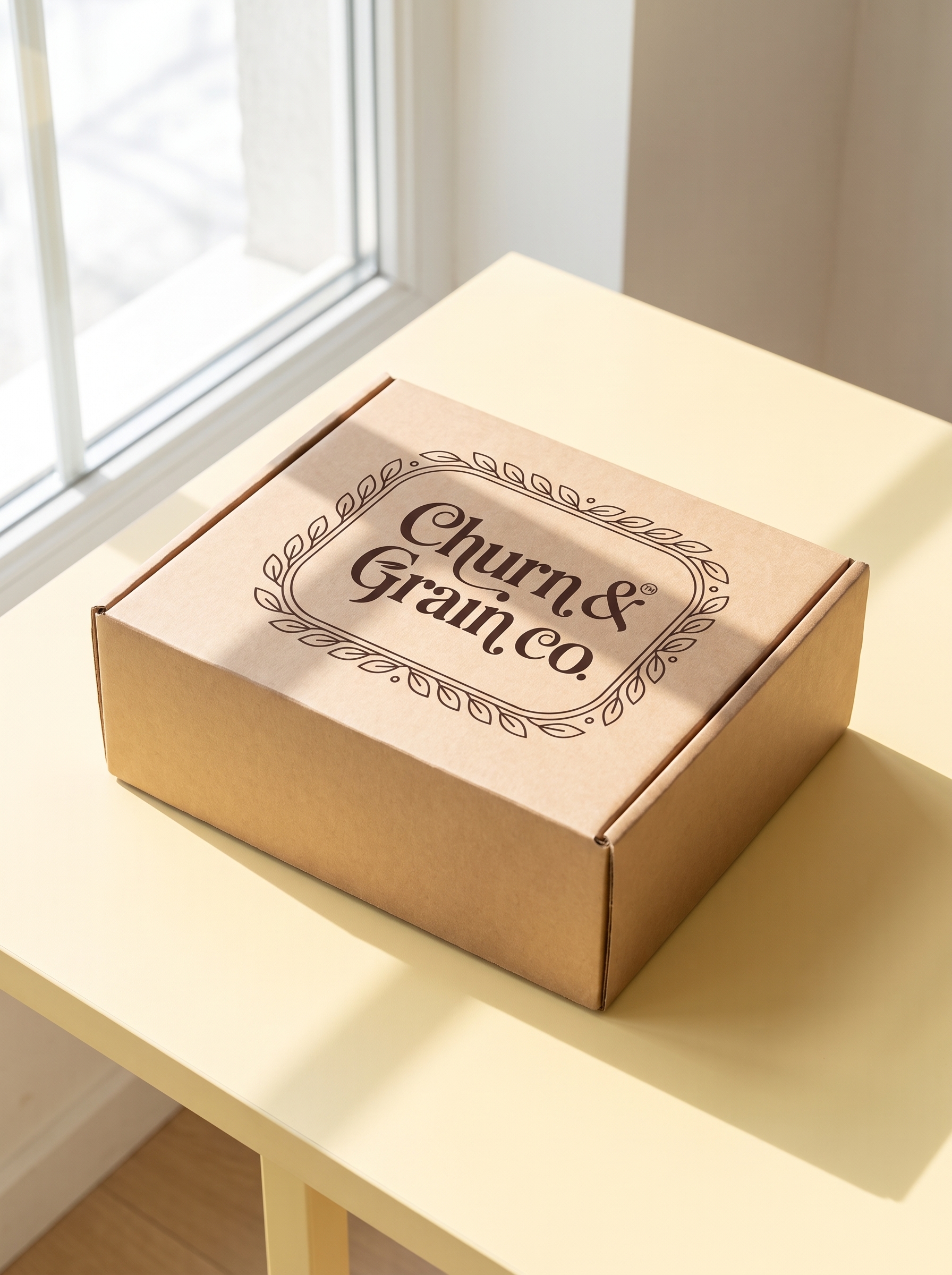

The logo was designed to express confidence through simplicity. Its clean, contemporary form reflects the brand's commitment to transparency while remaining timeless and adaptable.
Typography
abcdefghijklmnopqrst
123456789
!@#$%^&*()_+
abcdefghijklmnopqrst
123456789
!@#$%^&*()_+
Minion introduces warmth and cultural authenticity, while Helvetica provides structure and readability. Together they create a typographic system that feels both refined and approachable.
Color Palette
A curated colour palette creates strong shelf recognition while maintaining a premium and trustworthy appearance across every touchpoint.
Graphic Language
Bold typography, illustrative motifs, and clean layouts create shelf presence that feels energetic and trustworthy without defaulting to visual clichés.
Brand Architecture
Churn & Grain follows a master brand architecture — every product shares one cohesive identity while using distinct product cues for easy navigation across future pantry categories.
05
Brand Applications
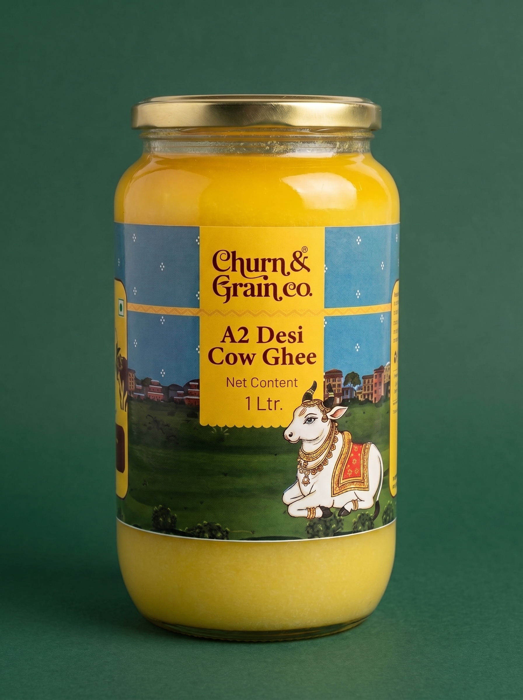
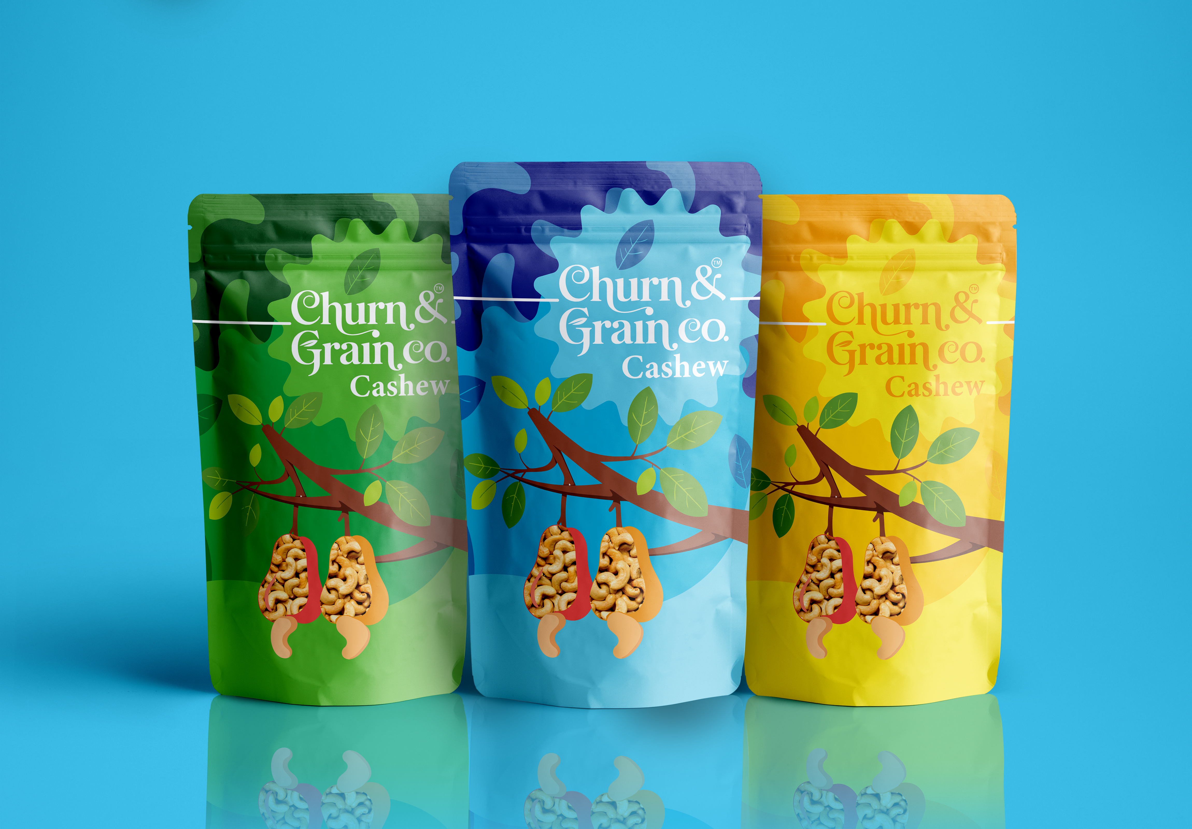

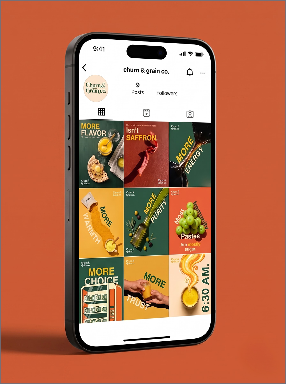
From packaging to digital communication, the identity system creates a consistent experience across every customer touchpoint, with a modular approach ready for future pantry categories.
06