01
Project Overview
02
The Problem
03
Discovery & Strategy
Research showed that people choose snacks based on emotion as much as nutrition. The strategy positioned Pramodan as a lifestyle brand that makes healthy snacking feel joyful, approachable, and worth reaching for.

04
Identity System
Logo

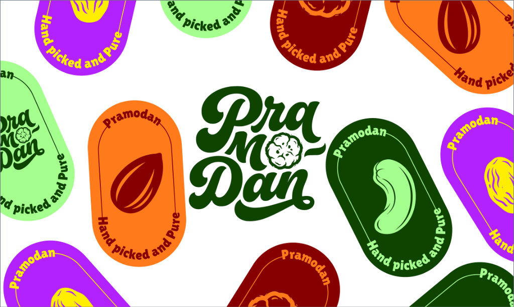
The wordmark subtly references the brand's cultural roots by transforming the "O" into a makhana that also resembles the Sudarshan Chakra — a memorable symbol without relying on direct religious imagery.
Brand Personality
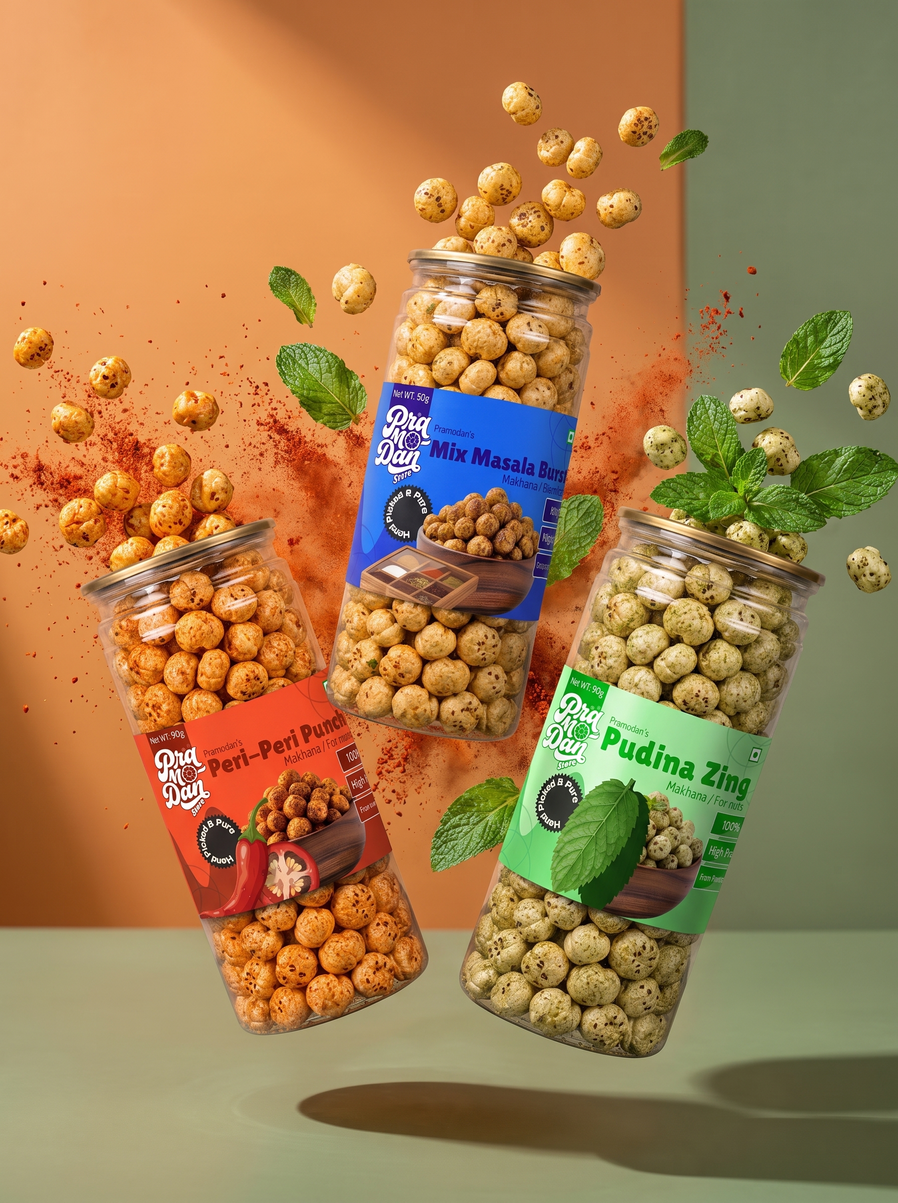
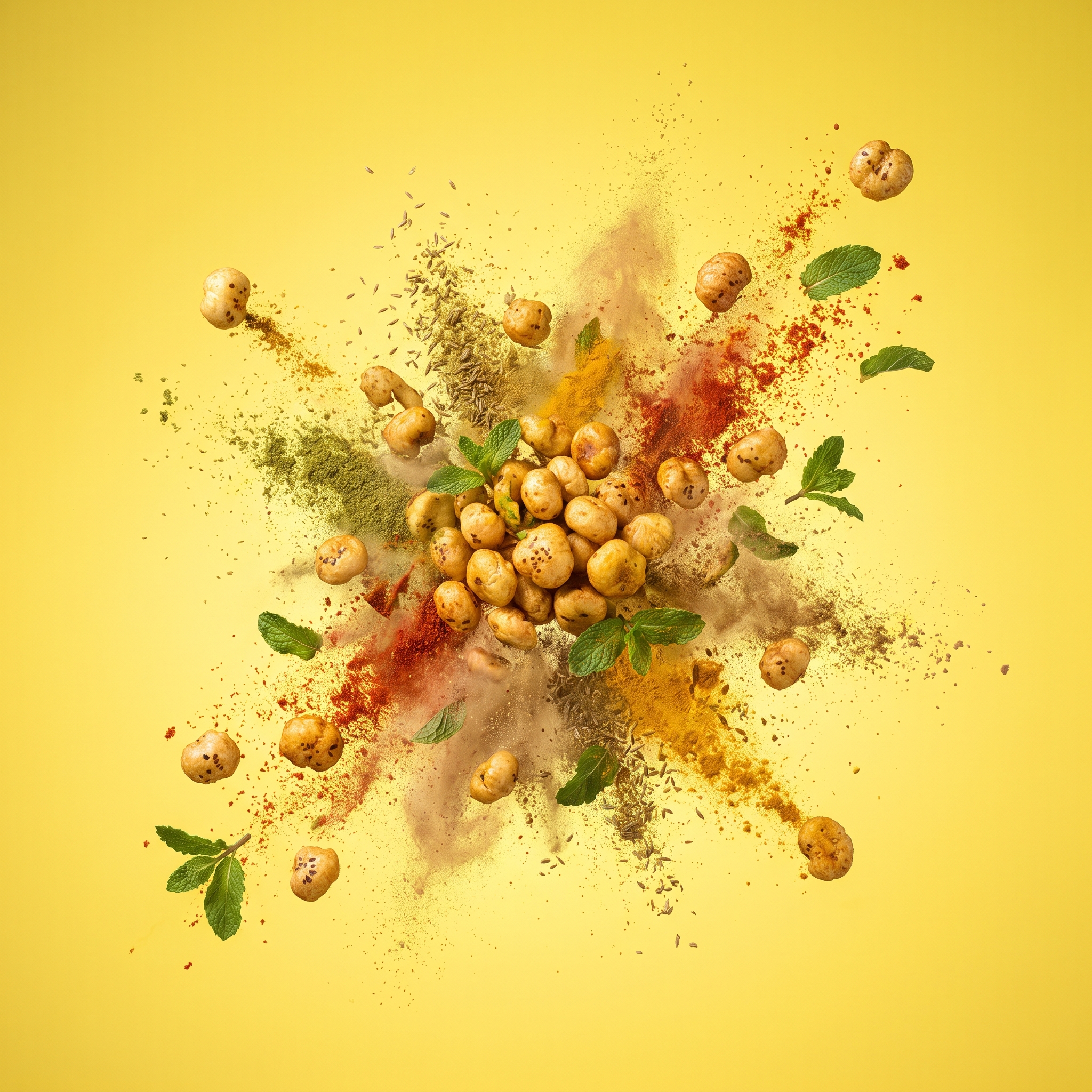
Inspired by the joyful nature of Lord Krishna, the identity expresses playfulness, warmth, celebration, and positivity through every brand touchpoint.
Color Palette
A flexible colour system gives each flavour its own identity while preserving strong recognition of the master brand across every product category.
Visual Language
Bold typography, playful graphics, and minimal layouts create a vibrant shelf presence that feels energetic without becoming childish.
Brand Architecture
The identity was built as a scalable system, allowing Pramodan to expand from makhana into honey, cookies, and future healthy snack categories without losing consistency.
05
Brand Applications
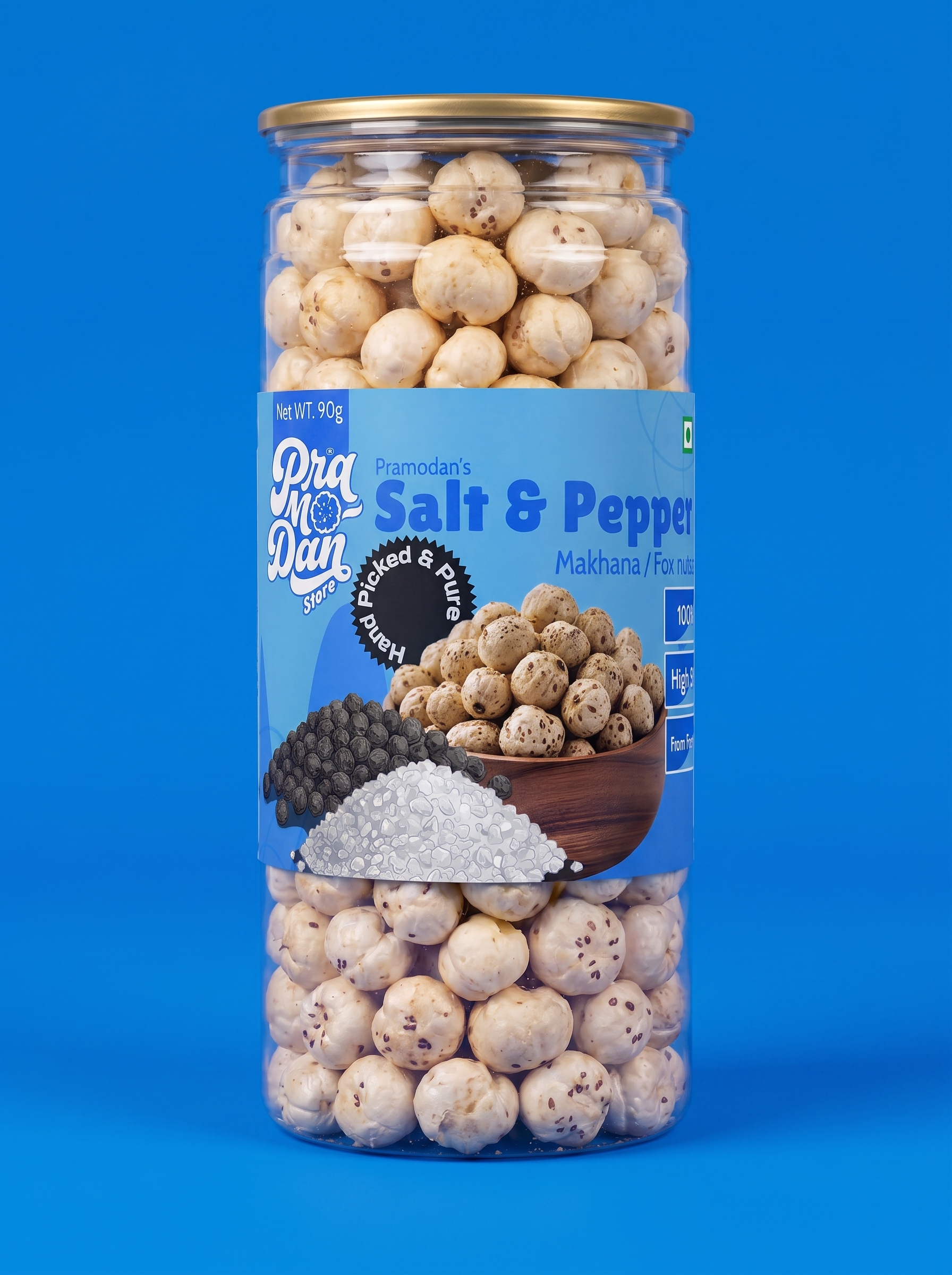
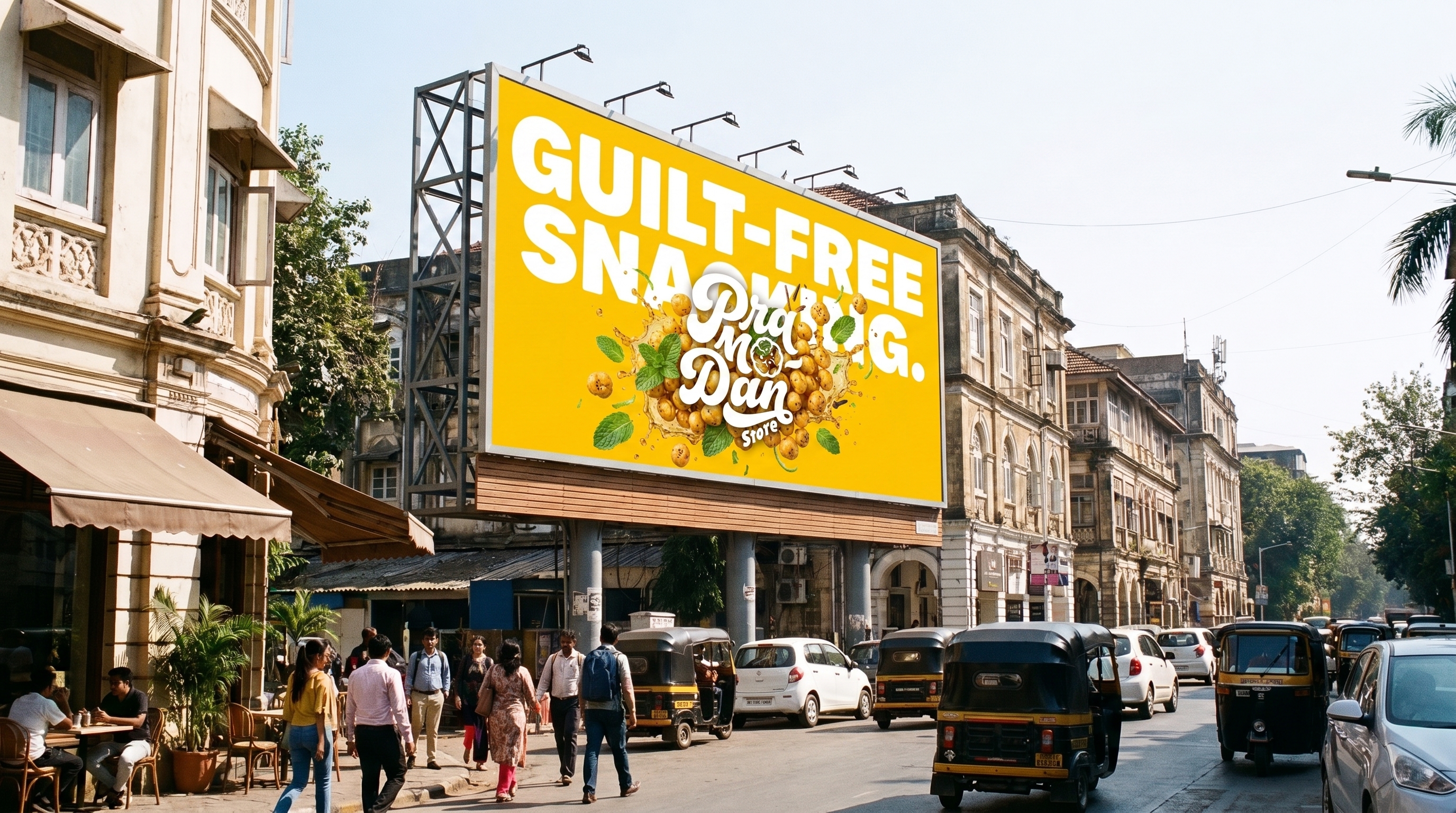
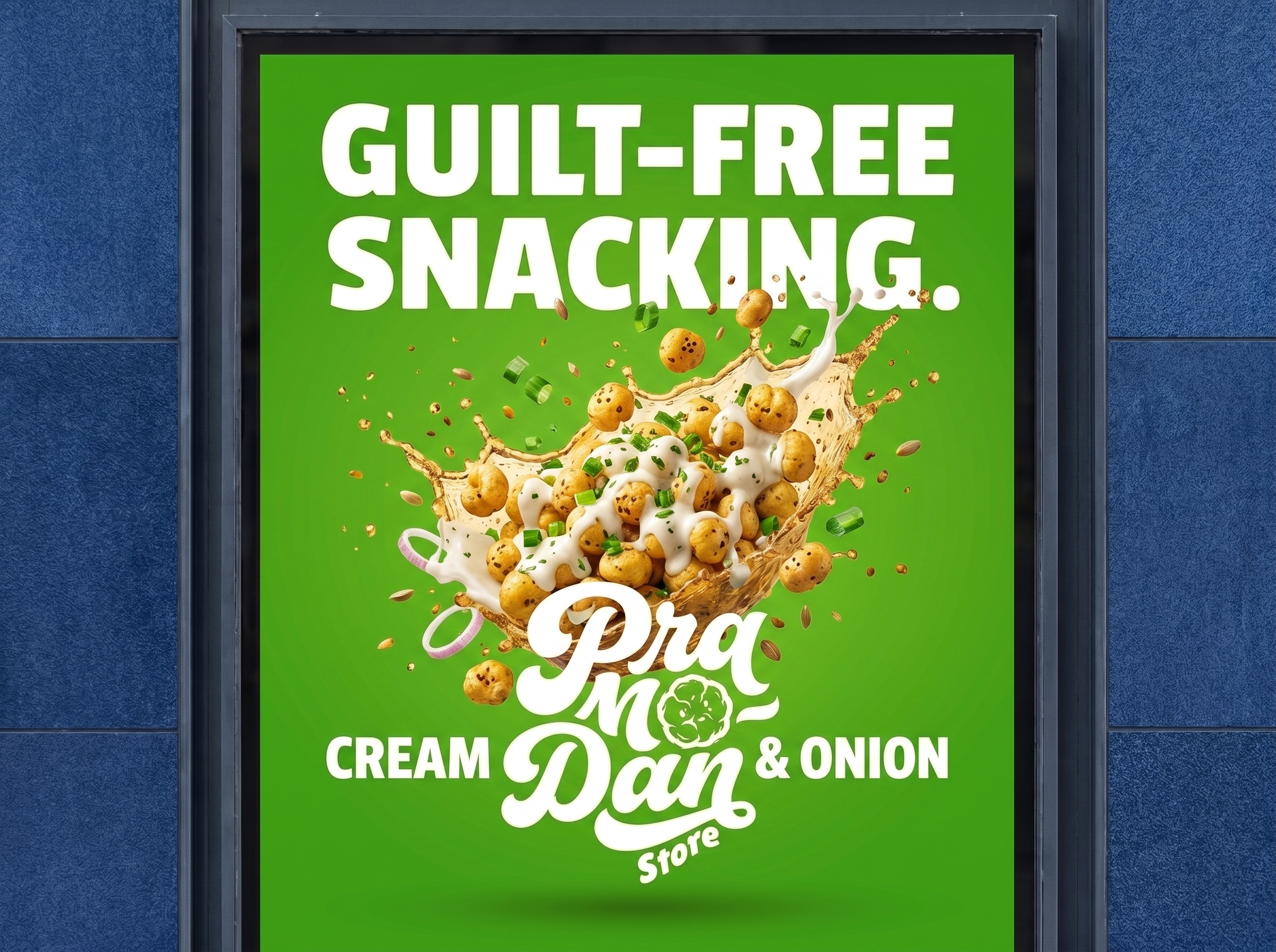
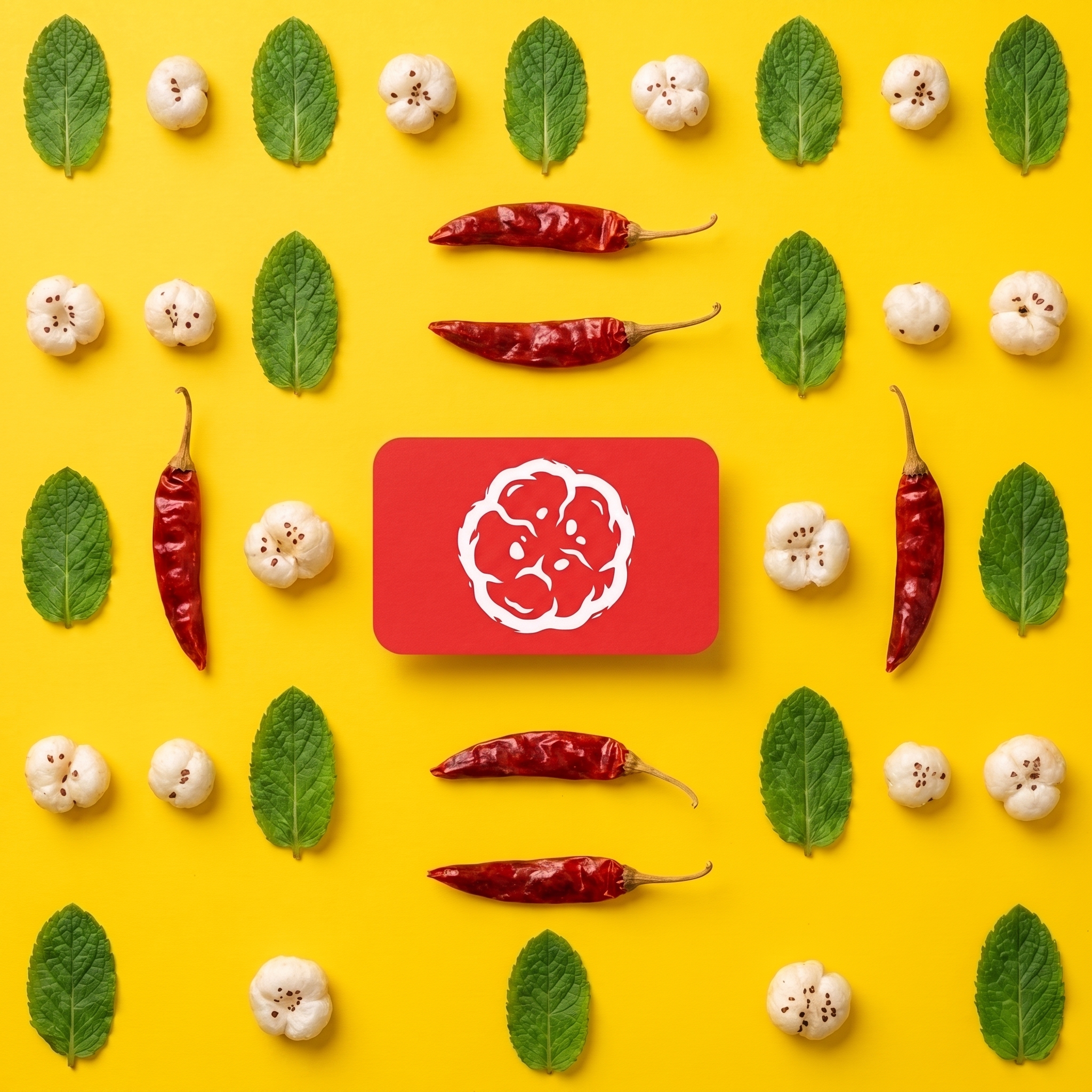
The visual system adapts seamlessly across product ranges and communication touchpoints, creating a cohesive identity that grows with the brand while remaining instantly recognisable.
06