01
Project Overview

02
The Problem
03
Discovery & Strategy
Research showed that younger consumers choose personal care products through lifestyle, design, and emotional appeal — not ingredients alone. The strategy shifted the conversation from Fitkari to Alum, transforming a familiar mineral into a modern wellness experience.

04
Identity System
Logo



A clean wordmark paired with a simplified crystalline icon creates a memorable identity inspired by alum while remaining contemporary and approachable for a younger audience.
Typography
abcdefghijklmnopqrst
123456789
!@#$%^&*()_+
abcdefghijklmnopqrst
123456789
!@#$%^&*()_+
Expressive display typography builds personality, while a modern secondary typeface ensures clarity across packaging and digital touchpoints.
Color Palette
Purple creates strong brand recognition, while yellow introduces optimism and energy. Accent colours differentiate fragrance variants without compromising the master brand.
Visual Language
Bold typography, minimal layouts, vibrant colour blocking, and generous white space replace the visual clichés commonly associated with herbal products.
Photography Direction
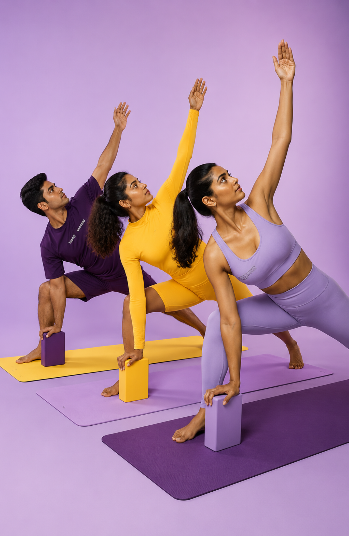
Photography celebrates movement, confidence, and self-expression, reinforcing the brand's youthful and energetic personality across all consumer touchpoints.
05
Brand Applications


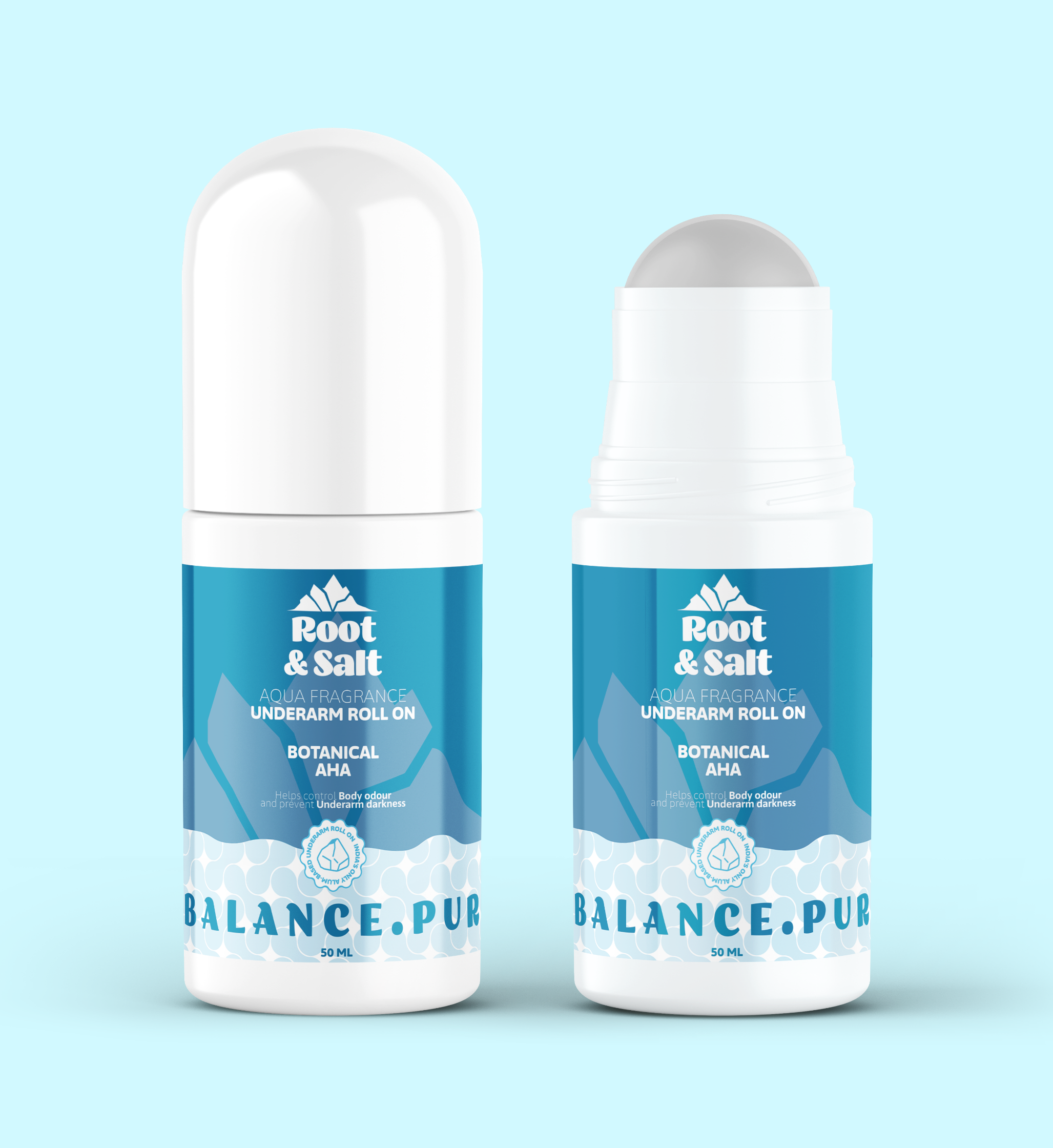
The identity system extends consistently across packaging, social media, merchandise, and digital communication, creating a cohesive brand experience across every customer touchpoint.
06