01
Project Overview

02
The Problem
03
Discovery & Strategy
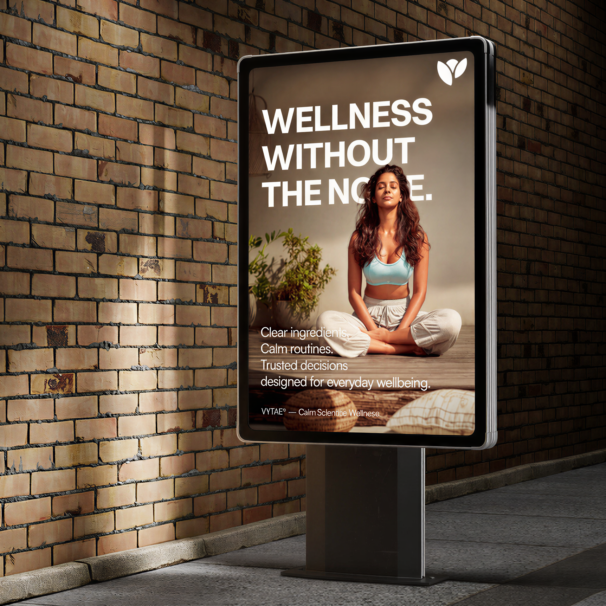
Research revealed that modern consumers aren't just asking what a supplement does — they're asking why they should trust it. The strategy became Proof Before Promises: design every interaction to educate first.
04
Identity System
Logo



A clean, minimal identity reflects precision and clarity, removing unnecessary complexity so the product and information remain the primary focus.
Typography
abcdefghijklmnopqrst
123456789
!@#$%^&*()_+
abcdefghijklmnopqrst
123456789
!@#$%^&*()_+
A structured typographic system establishes hierarchy and readability, making scientific information easier to understand at a glance.
Color Palette
A restrained colour palette reinforces calm confidence and credibility, allowing information to take priority over decoration.
Information System
Every visual element is designed to improve comprehension. Clear hierarchy, generous white space, and purposeful layouts help consumers understand ingredients, dosage, and verification with ease.
Verbal Identity
The communication strategy avoids exaggerated claims and unnecessary jargon, focusing on education, transparency, and evidence-backed messaging.
05
Brand Applications
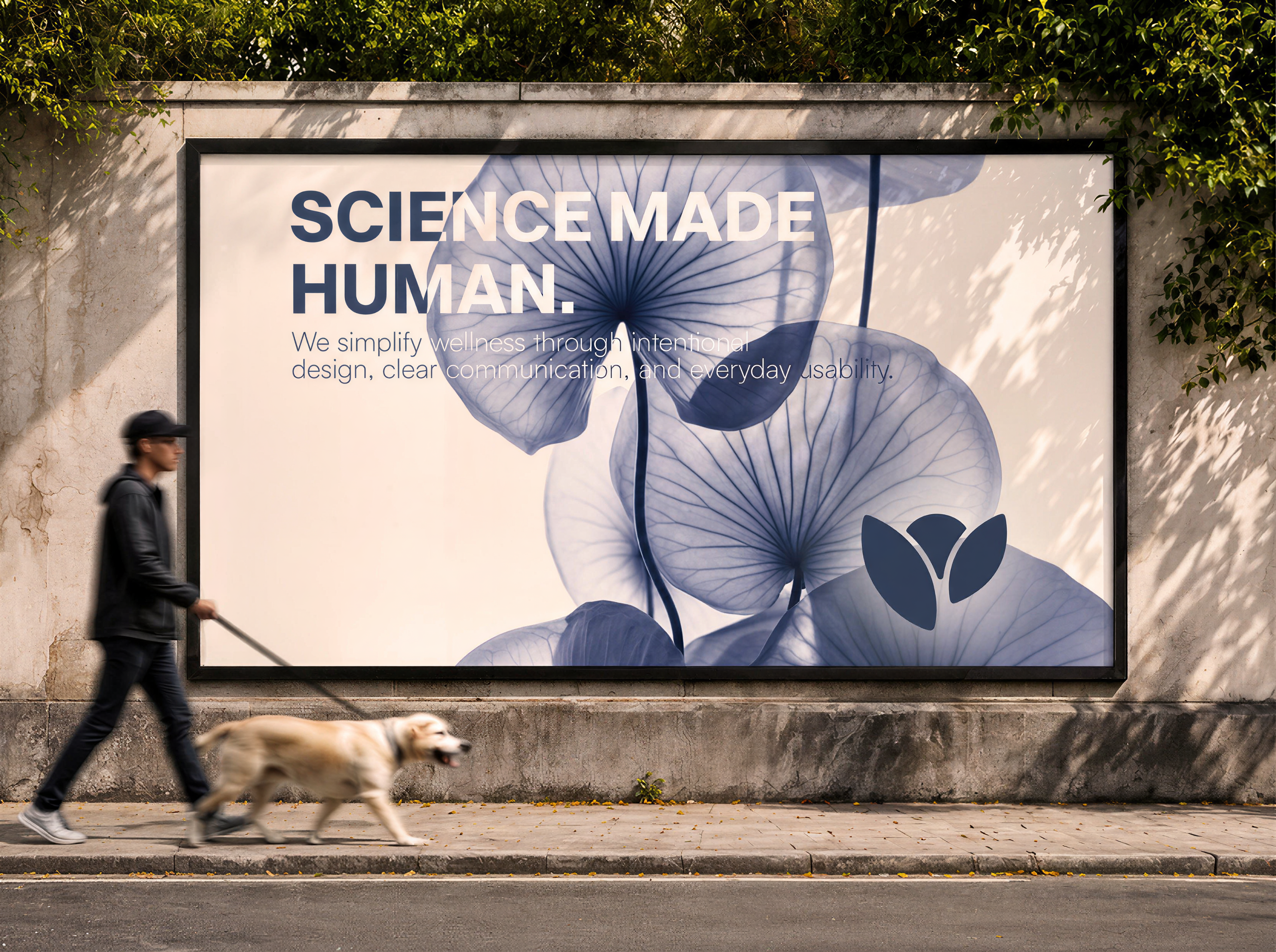


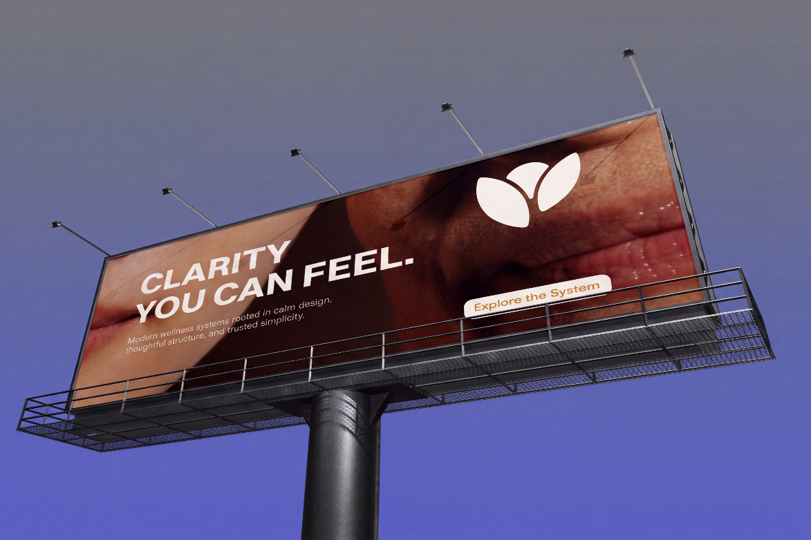
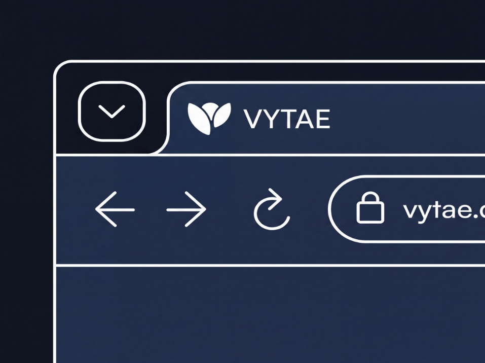
The identity system extends consistently across packaging and digital communication, creating a brand experience where every touchpoint reinforces clarity, credibility, and informed decision-making.
06